Design patterns from games do more than entertain. They guide how people react, interpret, and move through what they see on the screen. When something works well in a game, it is often because the design helps the brain make quick and confident choices.
One notable pattern is called “cluster pays.” It groups symbols so that any cluster, rather than just straight lines, brings rewards. When this idea is applied to visual storytelling, it changes how people read and connect parts of a story. They begin to see meaning in what is placed close together.
What Is “Cluster Pays” and Why It Matters
Traditional slot games rely on matching symbols in straight lines. With cluster pays, symbols form a win when they touch or sit beside one another in any direction. This shifts attention away from perfect order and towards proximity.
Players are no longer chasing fixed patterns. Instead, they are scanning for groups. This mechanic rewards the eye for spotting clusters rather than isolated elements. It creates more opportunities for engagement and supports a fast-paced gaming experience.
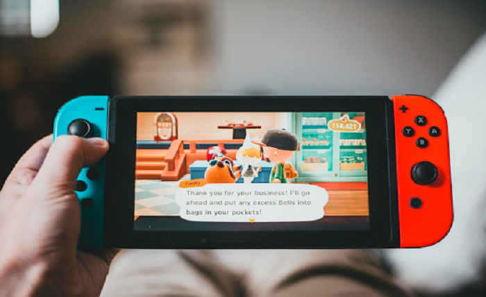
One example is the slot game Loti Fortune. It uses cluster pays to draw players’ attention to symbol groupings instead of single matches. The result is a screen that feels interactive and alive, keeping users engaged without overwhelming them.
This principle has value beyond games. Designers can apply the same approach when building websites, digital tools, or printed materials. Grouping related content makes it easier for people to scan and understand information quickly.
In visual design, how things are arranged often speaks louder than the content itself. Cluster-based thinking helps creators focus on the relationships between elements, which supports faster interpretation.
Visual Storytelling: Building Meaning Through Proximity
Some of the clearest visual stories are told without a single word. A comic strip, photo sequence, or storyboard shows how meaning emerges from arrangement, not only from content. When two characters are drawn close together, viewers assume a connection.
Instead of relying on lists of details, visual stories depend on layout. When panels are grouped closely, they are read as part of one idea. When images are spaced apart, they feel separate or disconnected. This spacing guides viewers on how to follow the story.
Using clusters in design prompts the eye to process ideas as units instead of isolated points. People naturally assume that items grouped together belong together. This helps move attention across a page without confusion or pause.
Cluster-based layout works well for both simple and complex storytelling. In children’s books, images are often grouped to guide the reader’s eye. In formats such as museum exhibits or webcomics, clustering helps readers follow the flow more easily.
Designers who think in clusters create smoother storytelling experiences. It is not about clever graphics but about arranging elements in a way that the brain instantly understands.
Data Representation: Grouping for Insight
Data design is often where people struggle. There can be too much to look at and not enough guidance on what matters. Clustering helps solve this challenge.
When data points are grouped visually, patterns appear more clearly. In a heat map, similar colours close together form a cluster. In a scatterplot, points that group in one spot suggest a trend. This saves time and energy for the person interpreting the data.
The aim is not to make things simply attractive but to make them practical. Good design puts related items close together and removes distractions. Dashboards that follow this method are easier to use. People do not need lengthy instructions or guesswork to find what is important. The layout communicates directly because the clustering tells the story.
Charts with scattered or unrelated elements force users to spend more time identifying patterns. When layouts use cluster-based thinking, the message is clear at a glance. This kind of design respects people’s time and attention.
Applying this principle benefits more than just data experts. Everyday users can look at grouped visuals and quickly draw conclusions. That is the power of a well-structured layout.
Interactive Displays: Designing for Relational Clarity
Interactive spaces need to be easy to explore. This means placing buttons, images, or information in ways that feel natural. Grouped elements help people decide where to go next without hesitation.
In mobile apps, users expect similar features to sit close together. Search tools, filters, and menus work better when they are side by side. If these tools are spread across the screen, the flow is broken and friction is created.
This is where design takes its cue from cluster pays. The user does not want to search across the screen for related tools. They want them nearby, working together. When grouped well, each section feels like a self-contained unit of action.
Kiosk screens and digital exhibits use this logic as well. Visitors interact more easily when they see related content presented in tight, focused areas. The display not only shows information but also invites action.
Minor layout changes, such as moving related icons closer together, can lead to a better user experience. The brain is quick to spot relationships, and effective design should support that instinct.
Wrap Up
Drawing ideas from games into other design fields is not just enjoyable but also highly practical. When proximity is treated as a tool for meaning, people connect more easily with what they see. It is less about explaining and more about showing. Grouped elements tell a story on their own, and that is a pattern worth noticing.